Categories
Training Websites

MII

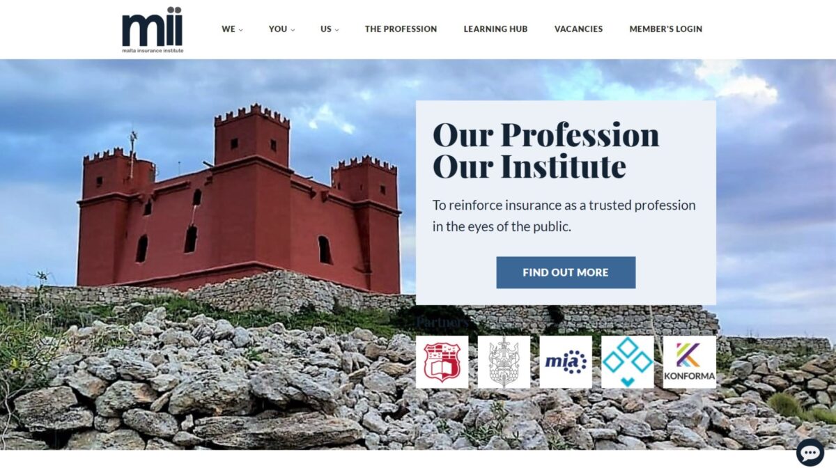
A website for a Malta-based professional memberhsip organisation for practitioners within the insurance industry.

MII requested a modern, mobile-friendly website with a formal look-and-feel. Notable customisation: multiple sections with updating content (Practitioner stories, News, Events, President’s Pen), custom social media/contact menu and dynamic and interactive home page features.

Testimonial

For the Malta Insurance Institute, Benjamin put together a highly professional website design which highlighted his creativity and which was delivered within a very tight deadline and with minimal instructions. He produced an effective and easy to navigate website to the full satisfaction of the Council.

Pauline Azzopardi
Vice President, Malta Insurance Institute

Website: www.MII.mt

Categories
Local and Web Apps

Project Nanite

Role: Front End (Past Contributor)

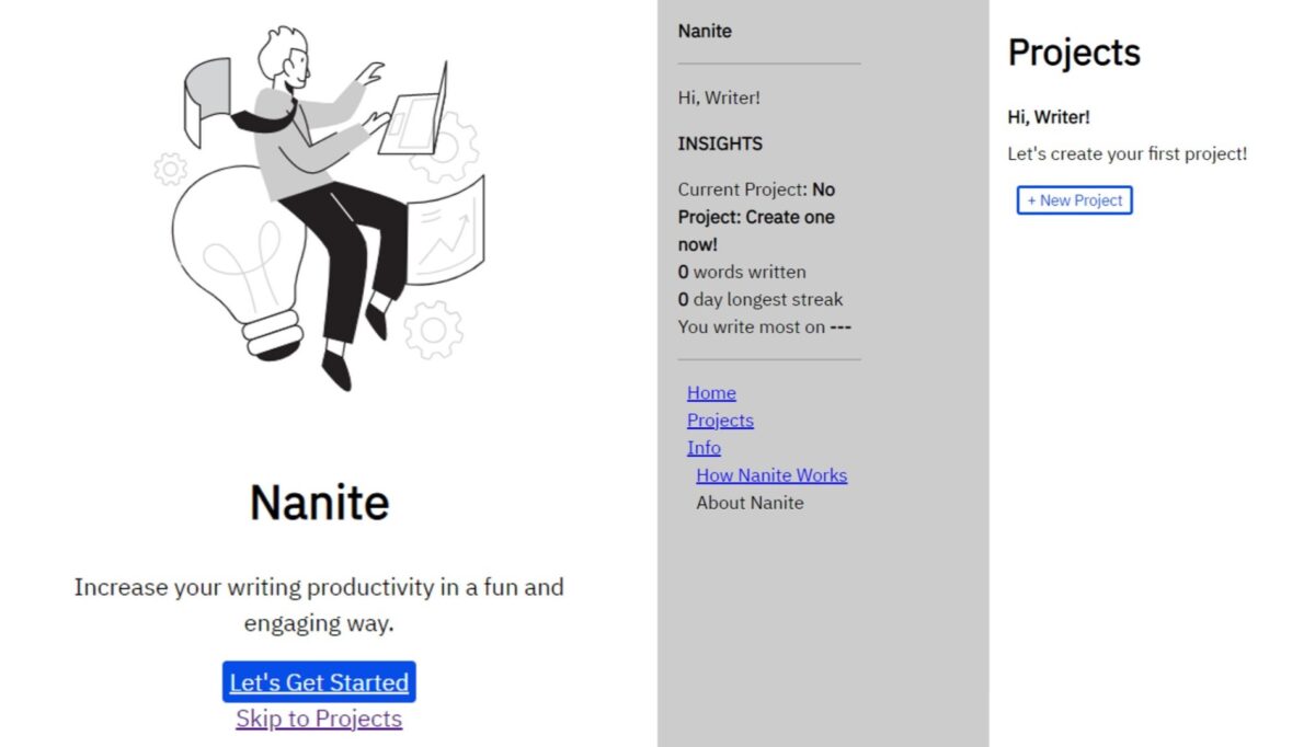
Project Nanite is a free, open-source writing productivity tool that reads from a writer’s files in order to give them analytics on their wordcount and writing habits.

I was an active contributor to Nanite (Front End) between 2020-21, where I first developed the front end on Flask, then migrated to Eel.

Github: https://github.com/ericoulster/Project-Nanite

Categories
Charity & Social Good Websites

Catholic Medical Association UK

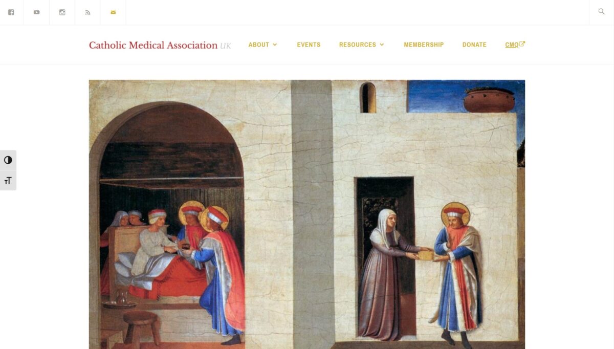
A website for an association of Catholics in healthcare professions.

The Catholic Medical Association (UK) requested a redesign of their website to present a more modern, professional look-and-feel and a mobile-friendly user-experience, with the ability to collect donations and register interest in events. Notable features: Calendar of Saints in Healthcare, events widgets in the footer of select pages.

Testimonial

I have had nothing but a good experience of working with Benjamin. He took time to understand the aims and mission of the CMA at the beginning of the project, and together we laid out the goals of the website. He had a positive attitude when encountering problems and challenges, and would actively consider and propose possible solutions. Benjamin was able to advise me on what makes an effective, visible and responsive website, and has integrated our new website well with our existing social media platforms, such as Facebook and YouTube.

Benjamin has a professional attitude to his work. This is exemplified by his initial work which was to draw up a scoping document to outline the parameters of the website project, and then by his clear and prompt email correspondence throughout the project, the production of demos to keep me up to date with progress, and the resulting quality of our new website.

Dr Rachel Nicholls
Leader of the Youth Branch of the Catholic Medical Association (UK)

Website: www.catholicmedicalassociation.org.uk

Categories
Websites

Ramona Depares

Testimonial

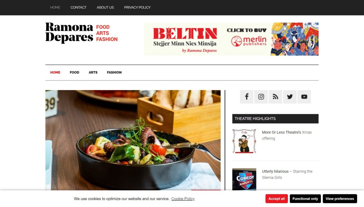
I knew exactly what I wanted my lifestyle website to look for, and what I wanted it to achieve. My worry was that between the picture in my mind and the end result, there would be a big gap. But with Benjamin Portelli I didn’t have to worry, thankfully. I explained what I was after and he provided the solutions, walking me through every step in the way to make sure I understood everything. I am very happy I trusted him with my site as I am already seeing the difference in performance and engagement. I’m also satisfied with the after-service, as Benjamin was always extremely helpful and efficient with any questions I had.

Ramona Depares
Journalist, Author, Lifestyle Commentator
Categories
E-Commerce Training Websites

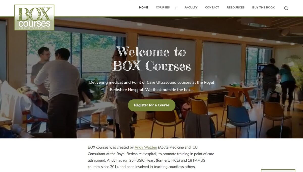
BOX Courses

A website for Point of Care Ultrasound training.

Box Courses requested a website to promote accredited Point of Care Ultrasound courses they run, and process interest and bookings for these courses. The brief was for a simple website that works well across different devices (mobiles, tablets and laptops), allowing visitors to find out abut upcoming courses and register for them. Notable features: eye-catching video on the home page and course signup form.

See here for a testimonial.

Website: https://boxcourses.co.uk/

Categories
Training Websites

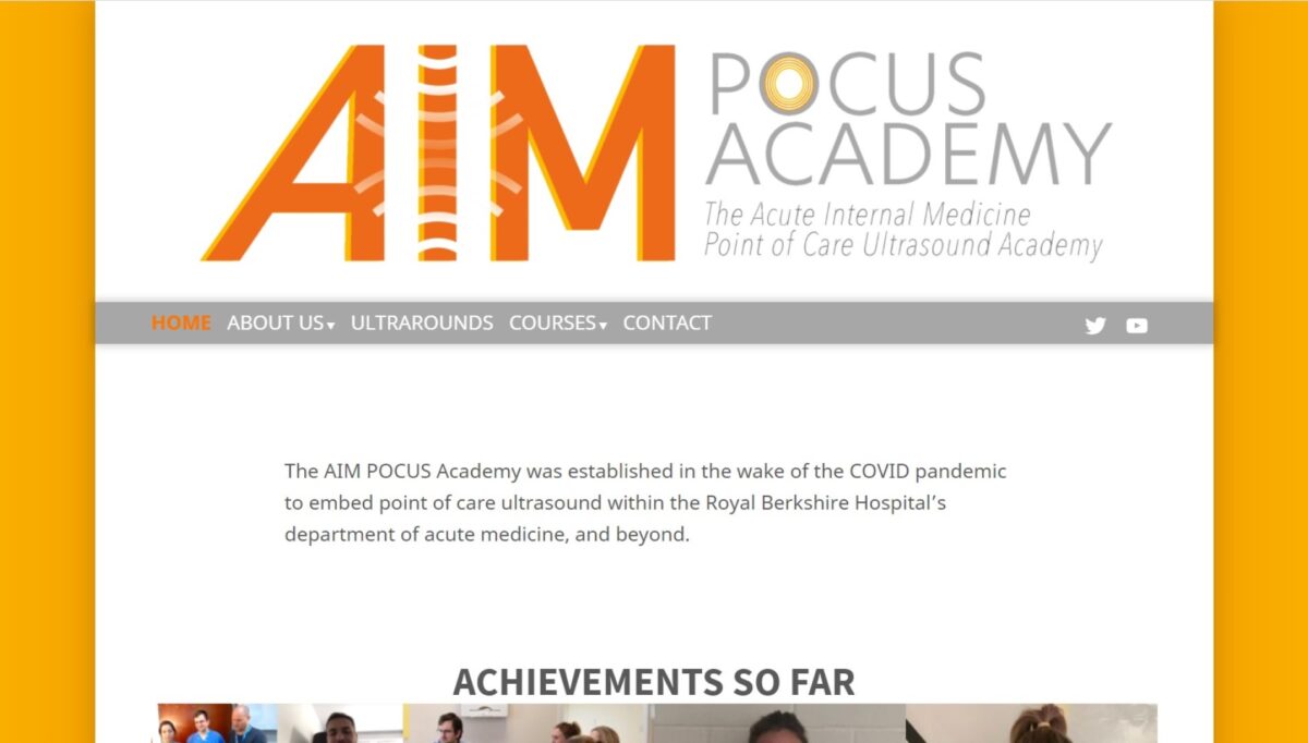
AIMPocus.co.uk

A website to promote accredited Point of Care Ultrasound training.

The AIM POCUS Academy was established to serve UK-based medical professionals in the wake of COVID-19. They required a website and social media presence to promote POCUS training to their audience. The brief for this website specified a light/bright look-and-feel, to match a logo and colour scheme already provided by a designer.

Website: https://aimpocus.co.uk/

Categories
Charity & Social Good Websites

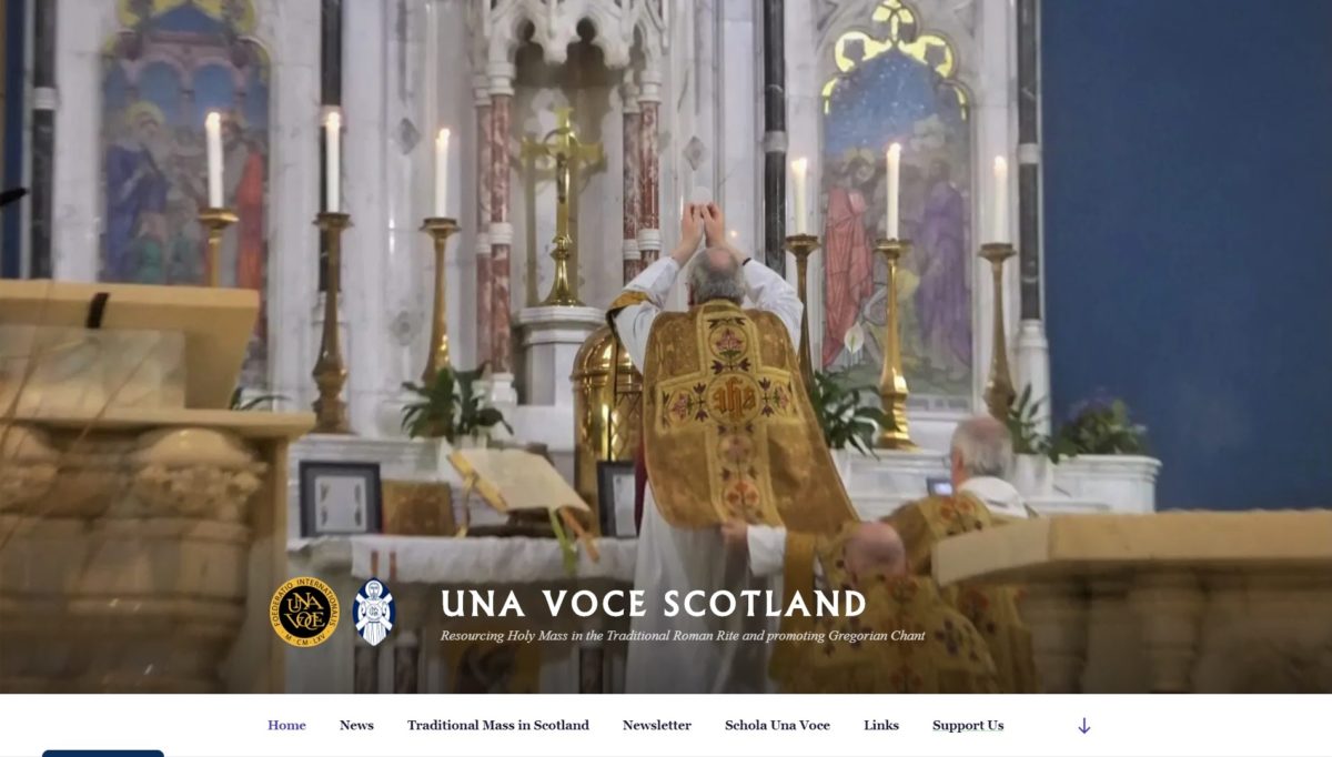
UnaVoceScotland.org

A website for a national Roman Catholic charity.

Una Voce Scotland requested an update to features of their website, while keeping the look and feel simple and light. The charity was looking in particular for a website that works well across different devices (mobiles, tablets and laptops), connects the website to social media/encourages engagement, and informs visitors about its work. Notable feature: interactive map of services around the country.

Website: www.unavocescotland.org

Categories
Charity & Social Good Training Websites

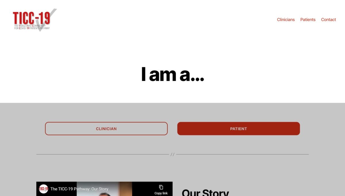
TICC19.com

A website to promote a new triage pathway for COVID-19.

The doctors behind a new triage pathway, TICC-19, developed at a hospital in Reading, wanted to promote their work with the aim of reducing pressure on NHS resources and giving better attention to patients in greater need. They requested a mobile-ready and social-media-friendly website to be developed quickly, with auto-posting to social media and content that can be modified or updated with ease. Notable features: interactive flowcharts and video players.

Testimonial

I approached Ben with the project to build a website with material for clinicians and patients, and the need for this to be up and running within one week. At that time I was working all day every day so I could not oversee the website very directly. Ben had to crack on with this website without my being available to answer questions regarding how it might look. A week later he sent the final draft to me, and I was very impressed. We launched the website (www.ticc19.com) and it has been very popular. As the pandemic progressed, we needed new material added to the website which Ben duly did. I was impressed with how Ben appreciated that this project was of great importance and could save lives, so worked day and night to get it done. A common remark of our colleagues when we were trying to explain the project to them, was the presence of a professional website.

Now that [the first wave of] the pandemic is over, my senior colleague and I asked Ben to create a second website for us for a project to train clinicians in ultrasound skills. This is quite a niche area of medicine, but Ben went away and read up on the topic so he could grasp what we were looking for. That website was launched within three weeks and is precisely what we were after (www.aimpocus.co.uk).

During the last couple of weeks Ben has started work on a fourth website for my aforementioned senior colleague.

I have been impressed with Ben’s reliability and professionalism in building these now four websites. The end results have been very slick. For each of the medical websites there has been a tight deadline, especially for the TICC-19 project.

Dr Joe Nunan
Ultrasound Fellow, Acute Medicine, Royal Berkshire Hospital

Categories
Profile Websites

Fraser Pearce

A website for a liturgical musician.

Mr Pearce requested a blog that was elegant and simple, with a few pages that outlined his professional interests and a look and feel that reflected it. Notable customisation: menu and header image.

Testimonial

Ben brought to our collaboration technical expertise and a lively creativity. My experience with him was marked by his commitment to delivering on my vision whilst offering his own dynamic interpretation. The whole process was aided by Ben’s ready communication and I am very satisfied with the results.

Fraser Pearce

Website: www.fraserpearce.co.uk

Categories
Charity & Social Good E-Commerce Websites

XirCammini

A website for a European NGO with an interest in trekking and ancient routes.

XirCammini requested a mobile-friendly website with a simple, clean look that’s easy to update. Notable customisation: multiple sections with updating content (Events, News, President’s Pen, Ancient Routes) and varying presentations in each.

Testimonial

For XirCammini, Benjamin put together a no-nonsense, simple but highly effective website design, using tried and tested web components. The committee was impressed by his willingness to spring into action at short notice, and work on his own initiative with a limited brief to meet the ever evolving requirements on a very limited V.O. budget. XirCammini has been more than happy to trust all further work to him!

John Chircop, XirCammini Director

Website: www.XirCammini.org