Categories
Training Websites

Wholeness Coaching

A website for a life coaching team.

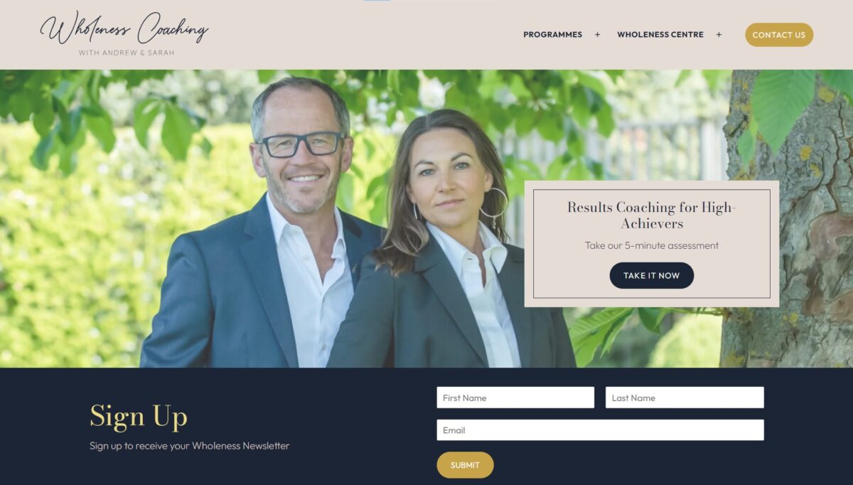
Wholeness Coaching requested the creation of a brand and website for their new life coaching business, for a modern, personal and professional look-and-feel with a mobile-friendly user-experience. The final website combines the work of two graphic designers along with the web design, all co-ordinated by Benjamin. Notable features: quizzes with custom results based on the answers provided.

Testimonial

As a new company, we were looking for a website developer to design our new website and brand.  Benjamin was highly recommended to us by a friend, who had also used him for web design.  We were delighted with the quality of his work; he paid such attention to detail which gave us confidence as this was the first time we had developed our own website.  The timeframe in which the work was completed was fantastic.  Benjamin stayed ahead of schedule, even when we made additional requests and changes.  He really took the time to understand us and our business.  He felt the essence of our work and portrayed it perfectly. We were very excited to launch our new venture and the whole website process was made very easy by Benjamin.  We have already recommended him to various people and have no doubt that they, too, will be impressed.  Thank you, Benjamin!

Sarah Maria
777 Strategies | Wholeness Coaching

Website: wholenesscoaching.co.uk
Categories
Training Websites

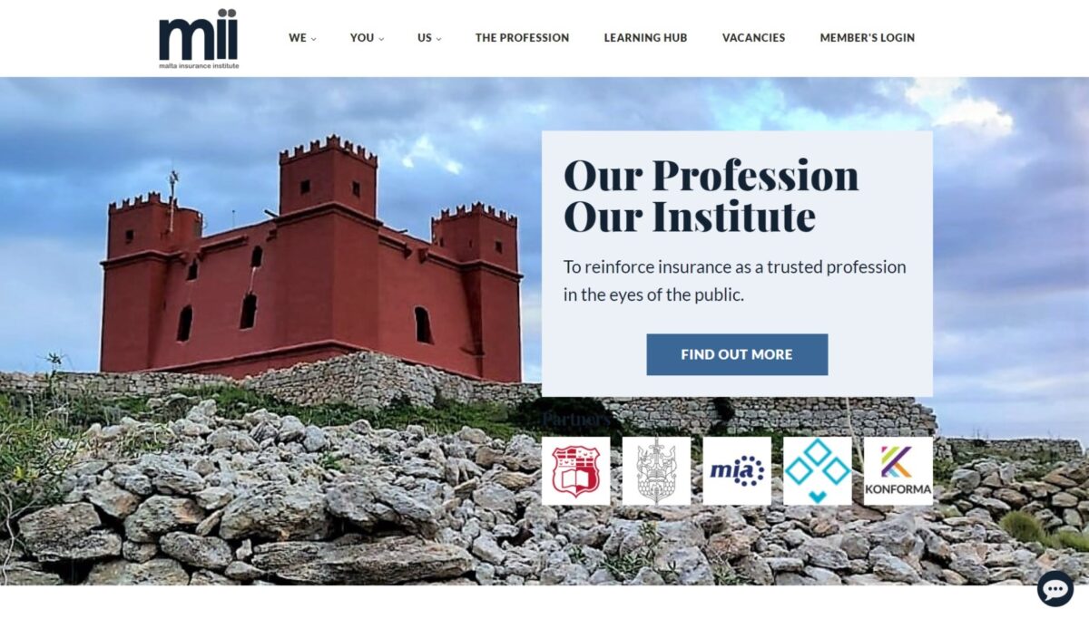
MII

A website for a Malta-based professional memberhsip organisation for practitioners within the insurance industry.

MII requested a modern, mobile-friendly website with a formal look-and-feel. Notable customisation: multiple sections with updating content (Practitioner stories, News, Events, President’s Pen), custom social media/contact menu and dynamic and interactive home page features.

Testimonial

For the Malta Insurance Institute, Benjamin put together a highly professional website design which highlighted his creativity and which was delivered within a very tight deadline and with minimal instructions. He produced an effective and easy to navigate website to the full satisfaction of the Council.

Pauline Azzopardi
Vice President, Malta Insurance Institute

Website: www.MII.mt

Categories
E-Commerce Training Websites

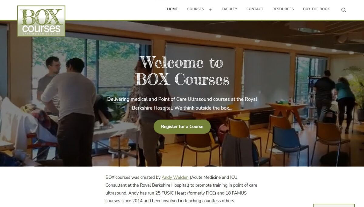
BOX Courses

A website for Point of Care Ultrasound training.

Box Courses requested a website to promote accredited Point of Care Ultrasound courses they run, and process interest and bookings for these courses. The brief was for a simple website that works well across different devices (mobiles, tablets and laptops), allowing visitors to find out abut upcoming courses and register for them. Notable features: eye-catching video on the home page and course signup form.

See here for a testimonial.

Website: https://boxcourses.co.uk/

Categories
Training Websites

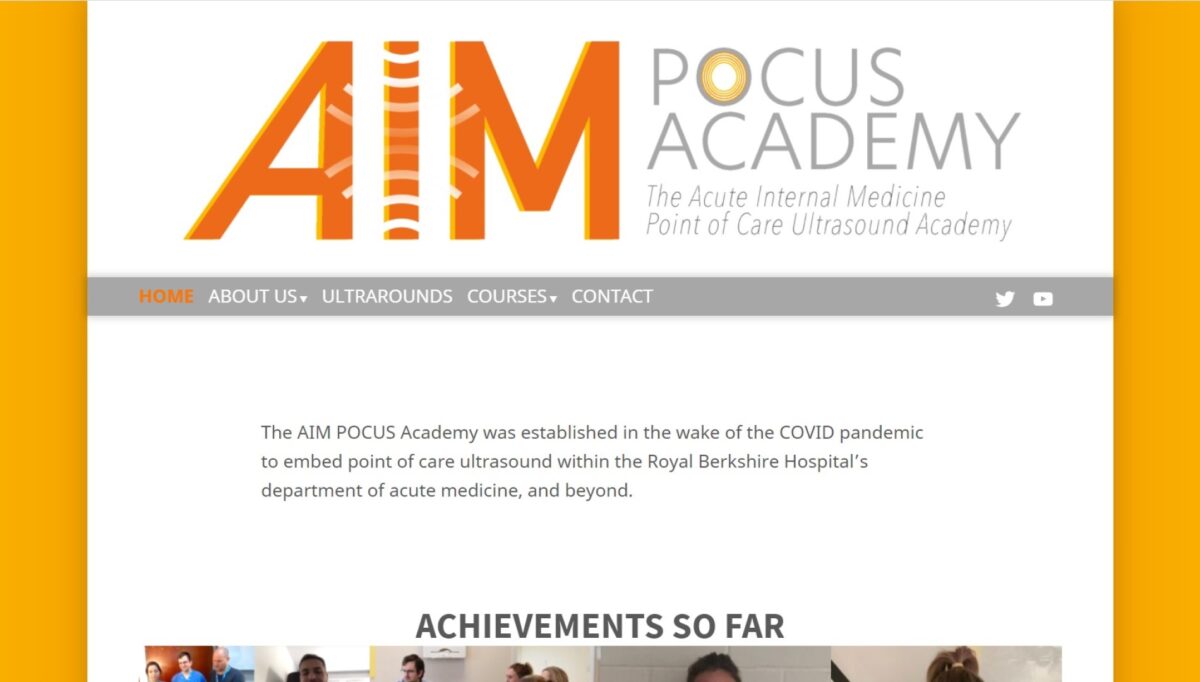
AIMPocus.co.uk

A website to promote accredited Point of Care Ultrasound training.

The AIM POCUS Academy was established to serve UK-based medical professionals in the wake of COVID-19. They required a website and social media presence to promote POCUS training to their audience. The brief for this website specified a light/bright look-and-feel, to match a logo and colour scheme already provided by a designer.

Website: https://aimpocus.co.uk/

Categories
Charity & Social Good Training Websites

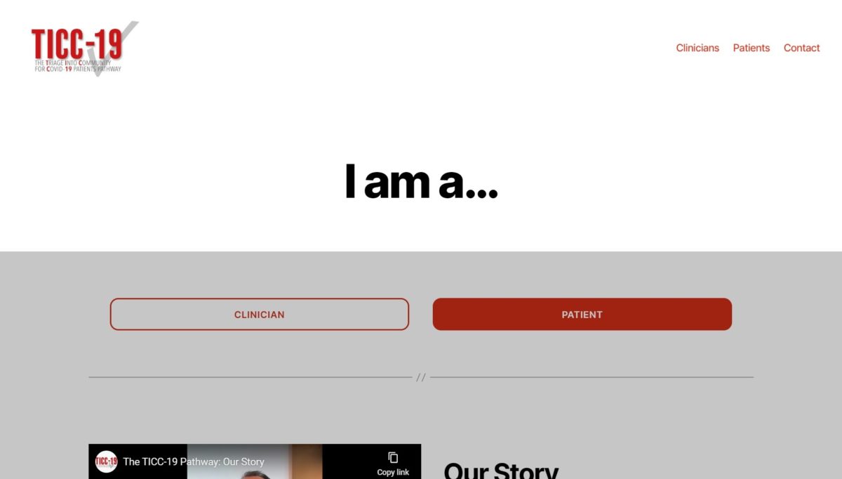
TICC19.com

A website to promote a new triage pathway for COVID-19.

The doctors behind a new triage pathway, TICC-19, developed at a hospital in Reading, wanted to promote their work with the aim of reducing pressure on NHS resources and giving better attention to patients in greater need. They requested a mobile-ready and social-media-friendly website to be developed quickly, with auto-posting to social media and content that can be modified or updated with ease. Notable features: interactive flowcharts and video players.

Testimonial

I approached Ben with the project to build a website with material for clinicians and patients, and the need for this to be up and running within one week. At that time I was working all day every day so I could not oversee the website very directly. Ben had to crack on with this website without my being available to answer questions regarding how it might look. A week later he sent the final draft to me, and I was very impressed. We launched the website (www.ticc19.com) and it has been very popular. As the pandemic progressed, we needed new material added to the website which Ben duly did. I was impressed with how Ben appreciated that this project was of great importance and could save lives, so worked day and night to get it done. A common remark of our colleagues when we were trying to explain the project to them, was the presence of a professional website.

Now that [the first wave of] the pandemic is over, my senior colleague and I asked Ben to create a second website for us for a project to train clinicians in ultrasound skills. This is quite a niche area of medicine, but Ben went away and read up on the topic so he could grasp what we were looking for. That website was launched within three weeks and is precisely what we were after (www.aimpocus.co.uk).

During the last couple of weeks Ben has started work on a fourth website for my aforementioned senior colleague.

I have been impressed with Ben’s reliability and professionalism in building these now four websites. The end results have been very slick. For each of the medical websites there has been a tight deadline, especially for the TICC-19 project.

Dr Joe Nunan
Ultrasound Fellow, Acute Medicine, Royal Berkshire Hospital